
Wireframes can help us create a solid foundation for the product design, but what do they look like? What should be included? Discover it all in this guide!
Wireframes are a common topic of debate in the UX design community. Are they meant to have any visuals at all? Do we need to have real content? Do we make several wireframes or just the one? Do we use wireframes with our design teams and stakeholders too?
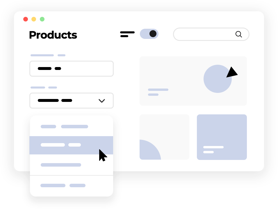
Wireframe your designs now with Justinmind
They’re meant to be ridiculously simple, but there’s still a lot of factors to consider when making one. That’s why we decided to make a one-stop-shop for everything you need to know regarding wireframes. Read on for a complete step-by-step guide that covers both the theory and practice of wireframing!
Wireframes are often compared to blueprints of buildings. In practice, they work as a map that helps the team settle on the crucial answer: what goes where?
A wireframe is a simple representation of a product’s design. They’re incredibly useful at the beginning of any design process because they represent a way to quickly get ideas down. Because they tend to focus on the big questions like the general space and layout, they help designers focus on the more functional aspect of the design before moving on to the finer details.
One of the things that give wireframes their massive popularity is that design teams can create several of them and then compare for the best option. A wireframe has the power to improve communication in the design team, by giving the team something tangible to discuss. They can bring validation into the fold in the first few phases of the design process, helping the team create a sound product that users can love.
We have two predominant types of wireframes: low-fidelity and high-fidelity. These two aren’t set in stone, as teams will often move from low to high-fidelity slowly. With each new round of details added, more validating is carried out and so on until we have a realistic wireframe that looks and behaves like the real thing.

Low-fidelity wireframes are all about layout, navigation, and information architecture (IA). These 3 are all key in laying the foundations of the product. Low-fidelity wireframes are meant to look rough and cover only the sheer basics, so there are no distractions like elaborate interactions or fancy visuals.
In contrast, high-fidelity wireframes will often include more detailed interactions and visuals. Design teams will take the time to slowly build on the design as they get more clarity on where they’re taking the product, increasing the fidelity of the wireframe. Towards the end, the line between a realistic high-fidelity wireframe and a high-fidelity prototype can be quite blurry.
If you’re not entirely sure of the lines that separate wireframes from other UX materials, check out our two posts: wireframes vs mockups as well as wireframes vs prototypes.
Wireframe your designs now with Justinmind
Despite how popular wireframes appear to be, there’s bound to be holdouts. To some designers, wireframes might seem like an extra step that doesn’t add that much value to the production process as a whole. But if that’s the case, why do so many design teams bother to make them?
The answer is that UI wireframes do add value, in their own way. A wireframe is meant to help you take an imaginary idea and bring it into the realm of reality. It’s often that something sounds good in our heads, but leaves us feeling underwhelmed when we see it for real. A tangible wireframe can change the way we feel about the layout and expose aspects that didn’t work as well as we originally thought.

Another way in which design teams take full advantage of wireframes is that as rough around the edges as they may be, you can still validate them. Even if we’re dealing with a bunch of boxes on paper, it’s always worth seeing how people react to it. Initial validation needs to be taken with a grain of salt because of how basic they are, but they can still guide you nonetheless. When it comes to things like validating the primary navigation, a wireframe validation can go a long way.
Wireframes are cheap and easy to put together, making them ideal to compare initial designs and simply build on the best one. Rapid wireframing allows the team to write down all the possible routes so that no stone is left unturned. Once we can settle down on a winning design, the team can move forward with certainty that the foundation of the product is solid.
Having a tangible design can also help with communication, for the internal cooperation of the team as well as for external stakeholders, like clients. We can spend a lot of time debating or explaining design concepts and decisions, but nothing beats having something real and tangible to discuss.
Wireframes don’t tend to have too much detail, but there’s a lot of calculated components in them. This means that design teams need to do a lot of work before they can start wireframing, so that each move has a direction. Aimlessly placing components on a blank canvas is a recipe for disaster. Let’s take a look at some key materials you want to have at hand, so you can wireframe your ideas in a goal-oriented way.
The gathering requirements stage is all about defining the scope of the product and the basic things it needs to do. Often, this will mean spending a lot of time with the client, seeking to understand what criteria is relevant to the question: what does the product need in order to be successful?
This is a list of everything the design needs to include, from components to pieces of information, acting like a checklist so we don’t forget anything important. A silly example is that if an app wireframe means to sell items, you’ll need a checkout button, the correct forms as well as a way to disclose shipping information.

Wireframing is a directioned work, which means we need to know what we’re creating and for who. Your final users will have a great impact on the design, touching everything from the chosen navigation to the choice of buttons. You want the design to be tailor-made for the users, which means you need a very good idea of who they are and what they need.
Once you know everything that needs to go into the wireframe, comes the time to define how each of them relate to one another.
Your navigation patterns don’t need to be final and precise at this stage, but you want to have a good idea of the main pathways that users will use to get around the product – things like what goes into the primary or secondary navigation. The information architecture (IA) of the product manages all the content of the design, as well as the navigation aspect of the product. It’s all about structuring the information, so it’s easy to both grasp and interact with.
Much like other aspects of UX design, there isn’t a one-size-fits-all approach to IA. You’ll need a good organization system that helps users understand and navigate the entire design.
Organization systems: a structural framework that lays down the connection between different pieces of content so it can be understood logically.
With that said, most design teams will go for one or a mix of the following:
Hierarchical structures: places broad and most important categories at the top, presenting other smaller categories in a trickle-down effect. Also known as tree structures. This can help users find bits of information when there is a lot of content.

Sequential structures: creates a more narrow path that restricts the choices available to users, making navigation much simpler. This is a more controlled take to both information architecture and navigation design.

Matrix structures: creates connections between most features and content, and allows the user to navigate the way that suits them best. It’s complex to design and can lead to overwhelmed users by presenting too many options. If you go down this route, you need to be careful to not give users too little structure, resulting in a confusing user experience.

Organic structures: forsake any defined notion of “structure” or “sections”. The connections between content are done on a case-by-case basis, being more appropriate when the relationship between the content isn’t clear. This can be a fun way of exploring, but fails to offer users any indication of where they are in relation to the rest of pages or screens. This can result in a confusing experience for users.

Categorize information as early as possible, then refine your categories. Mixing different content blindly and expecting the user to sort it out is bad practice, to say the least. Test your categories on real users using card sorting, then refine your wireframe. If you can simplify something, do it. You want users to be able to find what they are looking for without much effort, so they can focus on how great the product is.
This face of wireframes is particularly important when we’re dealing with products that hold a massive amount of content. The more content you want to put into the design, the more important it becomes to organize it properly. You want to make sure that no matter much information there is, every user can find what they need quickly and easily. You need a hierarchy and structure that makes sense.
Many times, designers need to deliver a static product that doesn’t need to hold too much information or products that aren’t likely to change over time. This could be the case for a website wireframe that doesn’t have more than 3 or 4 pages.
However, the true challenge arises when we come face-to-face with a large product that is bound to grow over time. This is the case for platforms like Amazon or Medium, which have thousands and thousands of pages of content that will change quickly from one year to the next. This is when you’ll need a structure that helps users navigate that sea of content while still allowing the organic growth in content to happen – a structure that offers flexibility to adapt.
This is a good way to take your ideas and put them down so you can see it for real. This is a popular approach for two key reasons. Firstly, it allows you to get many ideas down so you can compare them and see which one is the best option. Secondly, drawing out your ideas on paper costs nothing and yet adds a lot of value to the entire project.
Having a UI sketch done on paper is a good move. It allows you to draw many different options and simply choose the best one. From there, you can start to create digital wireframe in order to refine the ideas that you first drew on paper.
Wireframe your designs now with Justinmind
It’s true that wireframing is a creative process, which means there’s no correct formula to building one. Each team will create and build wireframes based in their own creativity and resources, with the order of steps changing drastically from team to team.
This is about implementing the basic design, adding each and every component to the wireframe’s screens. The jump from paper drawings to a digital wireframe can vary depending on the project or the design team. One common factor is that designer try to keep things simple in the beginning, using UI components that aim to reflect the functionality of the screens and features – not the visual style of the final product. It’s a way to include components that show more detail than paper drawings, while keeping the entire UI strickly functional.

This means that design teams will carefully choose one UI kit that is applied to the entire wireframe, so that each component acts as a placeholder for the final stylish component. Usually, the wireframing is done with one of the following UI kits:
A sketch-style U kit, like the ones found in Justinmind’s wireframe sketch UI kit. Made to reflect the same basic style of hand drawings, the UI components are casual and simple in nature.
A classic web wireframing UI kit. These components maintain that simplicity that helps designers focus on the functioal side of things, but create a slightly more formal type of wireframe. The web wireframing UI kit includes all the classic UI components and holds more than enough options for a web-based wireframe.
A mobile wireframing UI Kit. Working similarly to the web wireframing kit, the mobile wireframing UI Kit is all about mobile apps. The UI kit delivers all the most common components for mobile design, delivering more detail than simple hand drawings while maintaning simplicity.
Another subject of fierce debate in the design community. After all, how much visual design needs to go in your wireframe? Wireframes are ultimately meant to be simple, something design teams can put together quickly to create a foundation for the design before filling in the blanks later on.
This means that your wireframe shouldn’t include details like typography or a color palette. In the initial stages of the design process, you want low-fidelity wireframes that show basic structures and layout. This is about creating a solid base for the product with the IA and navigation, validating the sheer basics.
The only visual aspect the first few wireframes need to worry about is the layout. The general distribution of space is crucial, be it using real images or a simple placeholder. This will help you with the IA, giving you a better feel of the readability of the design early on.

This means that even at the early stages of wireframing any design, you’ll need to keep things like whitespace and visual hierarchy in mind. Many teams will find that their companies already have some guidelines as to the basics of any new design, like pre-established layouts and brand-oriented navigation templates. These can help the team to cover ground and develop on the wireframe quicker than usual.
Most design teams today will initially create several low-fidelity wireframes and compare them to each other, with the winner being developed further. Once we know more or less which direction we’re taking the design, we can start to add in more important details that will take the wireframe from a low-fidelity to a high-fidelity one. As progress is made in the design, we can start to play with the visual design of it all to elevate the product.
You can check out some inspiring wireframes examples for a better idea of how the design can evolve through wireframes.
This is something that still causes a lot of debate in the design community. When dealing with any given wireframe, should we use lorem ipsum as a placeholder or use real content? The reason for so much debate is that both sides have legitimate arguments, with design teams swearing by both.
On the one hand, lorem ipsum eliminates the need to wait for the real content. This speeds up the entire design process, as design can move forward with the basics while the content is created and written.
On the other hand, using lorem ipsum can be slightly misleading for designers. The hard truth is that real content won’t behave the same way lorem ipsum does. There’s no perfect alignment, no exact way to know how the distribution of text will feel. If we begin to rely heavily on lorem ipsum, we might find unpleasant surprises down the road such as last-minute adjustments of measurements.
The good thing about wireframes is that when defining the information architecture, we’re forced to think about the navigation. Perhaps we haven’t defined how everything ties in together to connect different parts of the product, but we tend to know where the main navigation goes and how it should look like.
The challenge comes from the fact that users don’t really want navigation for the sake of navigation. In fact, some design teams say that users don’t even want to notice the navigation design while exploring the design. It’s worth taking a moment here to appreciate that this doesn’t mean that we want to get from point A to point B in the least amount of clicks – this can result in quick navigation that offers poor usability. The ultimate goal here is to create a navigation that is as fluid and logical as possible.

Another point worth considering in the navigation of the wireframe is that users can feel lost. You want to tell people where they are, even if it’s just in general terms. This is a part of why navigation details like breadcrumbs have grown to be quite popular.
Lastly, you may want to consider offering two navigation menus. This can be particularly true for products that are extensive and offer many different features – sometimes, a single navigation menu doesn’t cut it. This is something you need to account for in your wireframe, defining what goes in the primary menu and what doesn’t make the cut. What features are central to the product? What things have a supporting role and can go in the secondary menu?
We know that wireframes are meant to be all about navigation and IA, without the distraction of flashy visuals. But what about interaction design? Are they considered a finer detail that we add-on to a wireframe that’s already evolved to a more developed piece of art?
The answer to that question isn’t black and white. Sometimes, you want to dedicate a few extra moments to create some basic interaction even to the simplest of wireframes. This can mean that while we shouldn’t worry about pretty microinteractions, we should always add the relevant navigation interactions. A dropdown menu should, in fact, respond to users’ actions. A button needs to lead somewhere.

This can seriously change the way users feel when using the initial design, making the validation more realistic. When the time comes to validate your navigation flow, these interactions will play an important role.
Wireframe your designs now with Justinmind
Carry out user research. This is a cardinal rule of any product development project. By the time you start to create wireframes to transform a conceptual idea into a tangible design, the research needs to be done and available to the entire team. Despite the initial simplicity of wireframes, they still need to be tailor-made for your users.
Build navigation patterns into your very first wireframes. It’s important to work the navigation into the design from the start. Users need to be able to find what they want, to be able to discover and explore. This is the last thing you’d want to be rushed or flawed. Besides, users like to know where they are at all times, making this a serious usability matter.
Collaborate and listen. Wireframing software improves team collaboration and facilitates the collection of user feedback. Use your wireframe tool to work simultaneously on online wireframes, comment on them and make them shareable on any browser or device. Listen to what people have to say about your work and then go back to the wireframe. Hive-mind collaboration is a great way to rapidly iterate and refine the design.

Keep it simple! Take advantage of a wireframe to validate basic functionality and make it as strong as it can be. Your team will be able to deliver better results if they are sure of the foundations of the design instead of constantly changing things about the layout, navigation or general IA. You want to create a solid foundation with a low-fidelity wireframe, then move on to finer details.
Don’t elevate style over substance. The wireframing stage is not the moment to waste precious time debating things like colors or images or anything strictly visual. Leave that to the final stages of UI wireframing, when you’ve got the base of the product down. Validating basic functionality before aesthetics will greatly improve your workflow, with much less re-work being necessary.

Don’t skimp on content. Yes, wireframes are meant to be quick and dirty. But using real content can avoid having to do huge reworks later on in the design. It’s true that this isn’t always possible, but it’s always preferable to placeholder content. We’ll dive deeper into this topic further on in this guide.
Don’t forget to test wireframes on key users. They may be kind of basic but early-stage validating can break open the design process and shine light into dark product corners. Even if all you have is a static wireframe with the bare bones, you want to get users face-to-face with the product and see how they react. The validation is meant to be done constantly as you develop the wireframe, not once you think the design is done.
Don’t use low-fidelity wireframes to convince stakeholders. This is particularly dangerous in the first stages of the design, when all you have is shapes and boxes. If the stakeholder isn’t a designer, it can be difficult to look at the wireframe and see the final design. That imagination jump doesn’t come easy to the average business analyst and can leave people feeling underwhelmed with the progress made so far.
Agile has grown to be such a popular take on the design process. It’s a way of doing things that boosts collaboration and aims to minimize re-work as well as meaningless documentation. The Agile methodology has helped teams all around the world to deliver better results more efficiently. But how does this impact the wireframing process? What does an agile wireframe look like?
1. An agile wireframing process isn’t documentation-free: this is a common misperception because the agile way tends to reject lengthy documentation. The truth is that no UX project can be entirely free of documentation, from the requirements to the specs document. The point is to trim the extra fat, not to commit to a keto-style of design. You still need to write the necessary things down and keep track of all the tiny details.
2. Low Fidelity Wireframing to validate the basics: here, the team creates a wireframe design of the project requirements, the content and the basic layout. When everyone knows what they’re doing, and how things connect and interact, it’s easier to complete the project, and reach your goals.

The wireframe should explain the basic functionality, including a simple explanation of the main steps, phases, and requirements, as well as the layout. These wireframes play the role of the map of your product. However, for a more precise model, you’re going to need a high-fidelity prototype.
3. High Fidelity Prototyping to refine the design: in the agile way, you work towards high-fidelity by taking small steps. The way is paved with constant validating so that your low-fidelity wireframe slowly evolves as more details are added to it. Along the way, you’ll check several checkboxes that will work with the wireframe to guide the design, like user flows, mental models, and plenty more materials that will work together to give the team more clarity.

4. Validation is the way to decide things: this is key in the agile process. Validating the progress made so far is crucial because it puts things into perspective. It can be tough for the design team to put themselves in the shoes of the user, making it necessary to hear it from the horse’s mouth. One of the beautiful aspects of the agile approach is that we can use the sprints to organize constant rounds of validating from the get-go. This type of mindset can have a powerful impact on the workflow for the better, bringing the design team closer with both users and other stakeholders.

Wireframe your designs now with Justinmind
Wireframes can be a good deliverable to communicate design ideas to your team, but you should always be careful when using them with other stakeholders. As we mentioned before, some stakeholders might not be able to fill in the blanks with their imagination, which makes a basic wireframe seem disappointing.
With that said, wireframes can still be used to communicate ideas to stakeholders – when done properly. After all, sometimes people need to see it to believe it and tight deadlines make presenting wireframes a necessity. Here’s how to use your wireframes and still get the presentation to deliver a good impact.
Some people have a hard time with wireframes. While designers will look at a wireframe and see the beautiful design they imagined, that leap may not come so easily for a developer, engineer, analyst or marketing team.
You need to know who is going to be in your audience and tailor the presentation accordingly. If you’re presenting to a room full of analysts who tend to focus on the bottom-line, a low-fidelity wireframe is definitely not the right way to go. Marketing people might have a bit more imagination to look past the placeholders and into a possible finished design. But what of the client? Can the client make the leap?

Another way in which you need to tailor the presentation to the audience is the depth of details. If the people in the audience don’t know anything at all about UX design, it’s probably not a good idea to get down to the nitty-gritty of navigation flows and microinteractions that will be added to the wireframe.
A wireframe without context is meaningless, especially to people who weren’t involved in the making of that wireframe. Your wireframes should flow from one to the other in a logical and meaningful way, with a complete story that has a beginning and an end. This will help your audience understand better what you’re showing them, as well as what it all means.
You can place your wireframes presentation in context by way of a user scenario. Scenarios show the motivation for user actions, the conditions surrounding those actions and the end goal. This can be a useful way to give the audience a certain context, helping them imagine the situation in their mind.

When you know your audience, you’re better equipped to speak to them in a language they understand. If you’re presenting to a room full of business executives, phrases like card sorting, empty state and modal window might fly over the heads of the people in the room, which takes away from the power of the presentation.
In truth, you want to generally stay away from jargon just for the sake of clarity. You want to draw people in and get them to see what you see when looking at the wireframe. You don’t want them wondering what card sorting or a modal window is.
It’s true that if you’re presenting to a room full of designers and creative professionals, you may want to get down to the nitty-gritty details – the specifics. It will all depend on who it is for and what message you want to convey to the audience. However, if even one of the people in the audience doesn’t have a design background, we’d advise you to speak in plain English.
A UX presentation is a chance to inform and educate your audience. You want them to understand where you stand in the design process, where things are headed and what waits for everyone at the finish line. However, it doesn’t need to be a one-sided conversation. To get the most out of your wireframe presentation, you want your audience to engage with the content you’re showing them.
By opening the presentation to questions, you invite the audience to participate and interact with the wireframe. Especially effective are open-ended questions that you can ask. These can be a powerful way to make the audience see a point without you having to flat-out say it, helping them see why the wireframe is the way it is.

If your audience isn’t design-savvy then there’s a good chance they’ll refrain from participating at first because of how foreign all the concepts at play are. It falls on you to create an environment where they feel comfortable commenting on your wireframe, giving you their true opinion about the work.
By creating room for non-designers to give input, you’re helping them be a part of the design process. This will help you in the long run as you continue through the stages of the design, improving general communication and making sure everyone is on the same page.
In the run-up to a wireframe presentation, you’ll undoubtedly have created a lot of information that’s pertinent to the wireframe: user personas, journeys, research, etc. Add these supporting materials to your deck. These documents might indeed be a strange sight to some people in your audience, but they provide insight into the bigger picture – by contextualizing the wireframes.
If you have to provide the presentation to stakeholders afterward, make sure it’s organized properly and the information flows in the right way. This means that your presentation needs to be easy to understand without you there to explain the details.

You might want to create the deck in various file types too: PDF, PowerPoint, and Google Slides. Not everyone uses the same pieces of software so it’s best to cover all bases when it comes to a presentation deck. Regardless of the format you choose, the important thing is to deliver the material in an organized manner so the stakeholders can make sense of it on their own.
Wireframes are crucial to any design process. They have the power to change the way we feel about layouts, get everyone on the same page and get mistakes out of the way quickly. Their simplistic nature and low cost can be true allies to designers, representing a way to ensure a solid foundation for the design.
With the right wireframes at hand, design teams are free to develop and build on their ideas, knowing that the main pillars (IA, navigation and layout) are structurally sound. Ultimately, this means that with wireframes, we can cut back on re-work, avoid delays and cut the general costs of the entire project. Now, that is a solid investment!
PROTOTYPE · COMMUNICATE · VALIDATE
ALL-IN-ONE WIREFRAMING SOFTWARE FOR WEB AND MOBILE APPS
Related Content
 Why should you use user personas and how do you create them? Get all the steps to build one, as well as a great example and a list of user persona generators!15 min Read
 UX design books that cover everything from layout design to the theory of user testing. Want to expand your horizons? Check out this awesome list!9 min Read
 UX design portfolios are your chance to showcase your top skills and best work. Check out this post for awesome portfolio examples and websites!10 min Read


